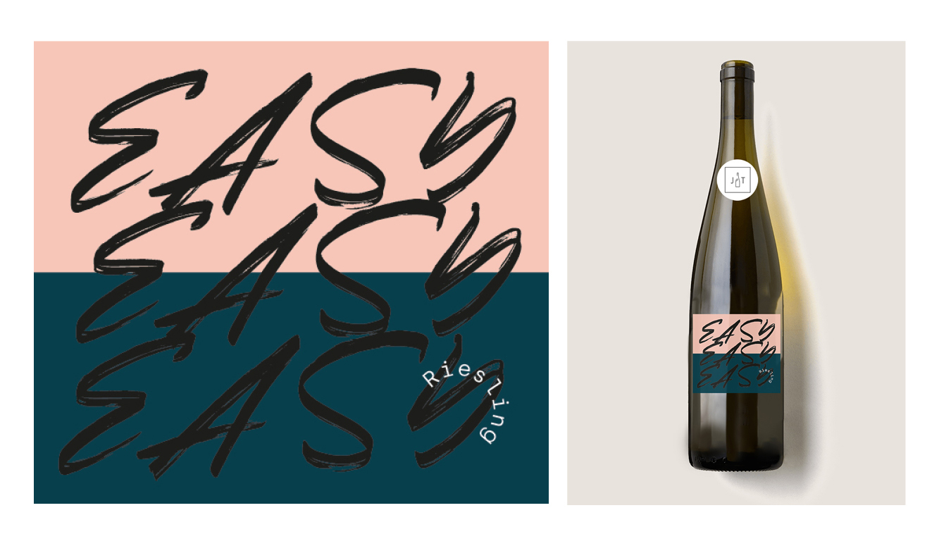
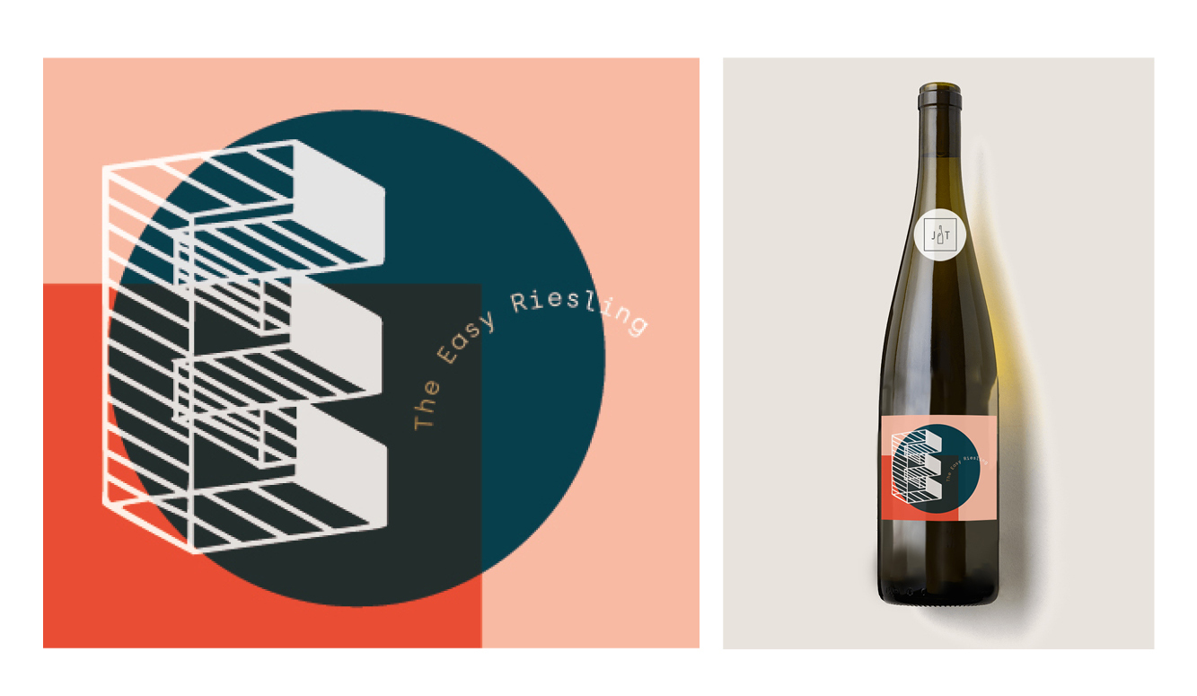
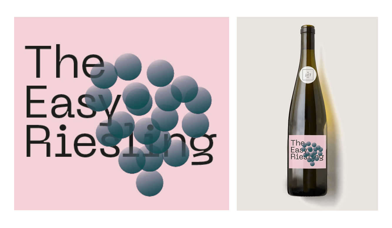
Junge Triebe
ART DIRECTION
LABEL DESIGN
Label design for German Wine Collective Junge Triebe (loosely translated as young shoots) for their 2019 offering; ‘The Easy Riesling’. Their requirement was for a confident, playful, modern label to appeal to adventure seekers aged 25-40, educated, well-travelled and ambitious. With an open brief, the designs challenged usual label conventions. Bold type, bold colour, and abstracted visuals formed the creative response.
_
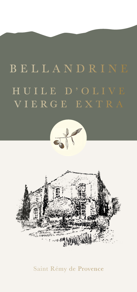
Bellandrine
ART DIRECTION
LABEL DESIGN
Olive Oil packaging for French artisanal producer Bellandrine, for the first pressing of their EVOO in late 2020. Featuring a die-cut label which echoes the location - Les Alpilles mountain range in Provence and gold foiled lettering to reference the olive oil within.
![]()
ART DIRECTION
LABEL DESIGN
Olive Oil packaging for French artisanal producer Bellandrine, for the first pressing of their EVOO in late 2020. Featuring a die-cut label which echoes the location - Les Alpilles mountain range in Provence and gold foiled lettering to reference the olive oil within.

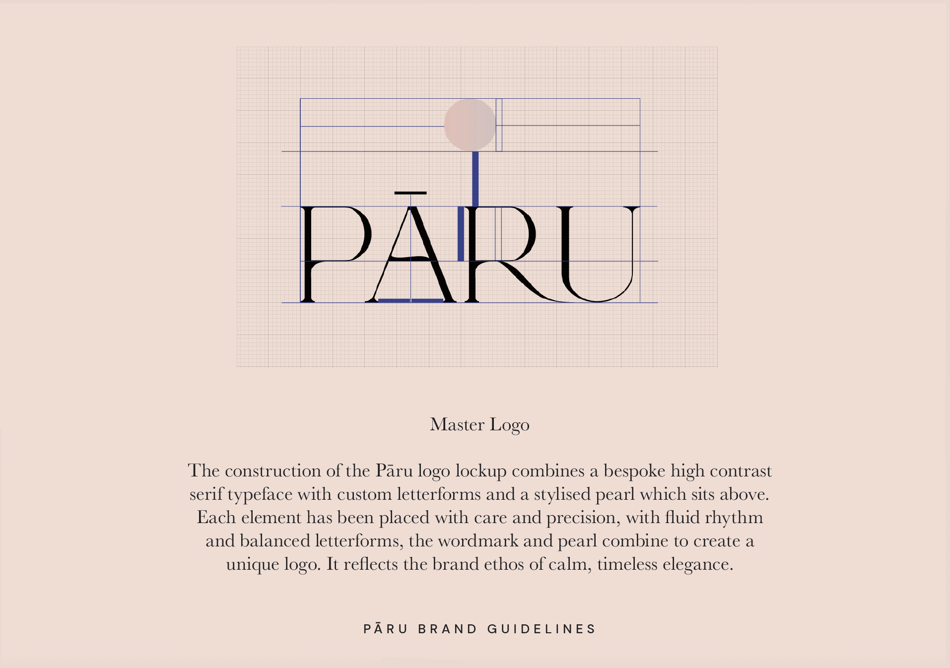
Pāru
BRAND IDENTITY
BRAND GUIDELINES
Brand identity and guidelines for Kuwaiti fashion start-up - Pāru, the label creating feminine, minimalist modest womenswear for an international market, focusing on simple clean lines and natural, sustainable materials. The ethos of the company is inspired by Japanese culture, with the brand name Pāru, the Japanese word for pearl. Bespoke hand drawn fluid curve lettering forming the brand identity.


Further brand identities:


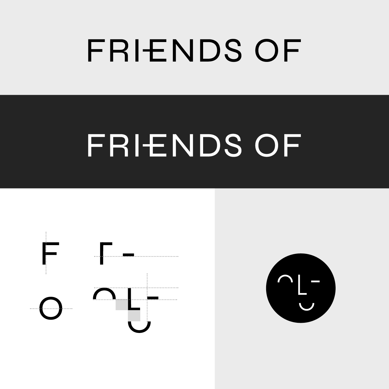
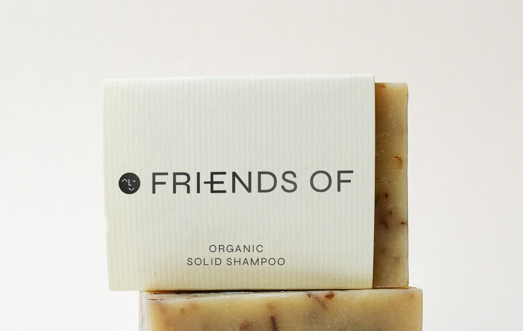
Friends Of
BRAND IDENTITY
BRAND GUIDELINES
PACKAGING DESIGN
Brand identity for wellness brand Friends Of - focussed on sustainability, with organic ingredients.
BRAND IDENTITY
BRAND GUIDELINES
PACKAGING DESIGN
Brand identity for wellness brand Friends Of - focussed on sustainability, with organic ingredients.


Quigley’s Red
BRAND IDENTITY
LABEL DESIGN
Craft Beer Packaging design for ‘Quigley’s Red’ - an Amber Ale produced by Drygate Brewery for Glasgow based restaurant - Red Onion.
![]()
![]()
BRAND IDENTITY
LABEL DESIGN
Craft Beer Packaging design for ‘Quigley’s Red’ - an Amber Ale produced by Drygate Brewery for Glasgow based restaurant - Red Onion.


